How Does a Web Builder App Work?

How Does a Web Builder App Work?

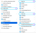
For illustrating how an app powered by the Web Builder works, we’ll take a closer look at the Scrivito Portal App, a feature-rich JS web application for easily getting started with the Web Builder.

You may want to refer to Getting Started with the Scrivito Portal App or the Readme at GitHub for details on how to install and run the Portal App locally.

What is the Web Builder? 

The Web Builder consists of two main components interacting with each other: a backend that transparently manages your content, and a JavaScript library (the SDK) that acts as a content management layer in a web application based on React. React is Facebook’s solution to building interactive web interfaces using self-contained components written in JavaScript.

The Web Builder SDK utilizes React to access and render the content in your Web Builder instance. Editors can create and edit this content in place via the Web Builder’s user interface that can be found at edit.scrivito.com.

How page display starts rolling 

After setting up and launching the Portal App, it is started via the “index.html” file and then served from the “src” directory of your local repository. Let’s take a look at “index.html” first:

The <head> doesn’t contain anything special, except that it preconnects to various resources for faster loading.

Obviously, the only visible part in the <body> of “index.html” is a “loader” that visualizes the loading process. However, a script called “main.tsx” is executed to boot the app and configure the website or websites concerned. As part of this process, “renderOrHydrateApp.tsx” is sourced to render the (prerendered) app, i.e., its current page including its environment and the components it consists of, using the “App” component from “App.tsx”.

Which page is the current one?

The App component renders the current page by calling the Scrivito.CurrentPage React component built into the SDK.

Initially, the current page is the homepage contained in your Web Builder instance. As the visitor navigates the website, the current page changes, of course.

Now, at startup, how does Scrivito.CurrentPage determine the object in your Web Builder that represents the homepage?

  • To find the homepage at startup time and render it, <Scrivito.CurrentPage /> determines the content object whose path is “/”. As the visitor browses the website, the page to become the current page is identified by the content object’s id contained in the linked URL.

Show me the page!

All content in your Web Builder is stored in attributes of content objects. To be able to have different types of objects (e.g. homepages, landing pages, standard pages), you can define object classes (models) and provide them with a set of attributes of your choice.

To get an overview of the object classes the Portal Application is equipped with, let’s take another look at the project directory, this time at the “src/Objs” folder.

The individual page types defined for a Web Builder app are represented as folders named after them. Each folder contains up to five JavaScript files, one for the model class (e.g. “HomepageObjClass.js”), one each for the component that renders its instances and layout, one for the CSS, one for configuring how attributes are presented to editors when they edit the properties of an object, and, optionally, a thumbnail displayed in the page type selection dialog. Except for the layout component, this analogously applies to the widget types in the “Widgets” directory.

Next to various page types, there is one for images, too. If you open the “ImageObjClass.ts” file in the Image folder, you can see that image objects are regular content objects, meaning that they can be given attributes.

The same applies to objects of the Download type.

Displaying content is rendering attributes

Now, back to pages and how they are rendered. First, all content is rendered by the React component that has been provided for the instances of an object class, i.e. the pages of a specific type. Second, all pages usually have an attribute of the widgetlist type. In the Portal App, it’s named body, but you can name it whatever suits best. It is this widgetlist attribute into which the main content of a page goes: the widgets an editor chooses to place on the page.

So, displaying a page breaks down to rendering the parts common to all pages of that type (the layout consisting of the header, navigation, footer, etc.) plus the widgets contained in the body attribute. All the React component of the page type needs to do is render this attribute:

This causes the contents of the body widgetlist to be rendered by the widgets’ corresponding React components. Let’s look into the “src/Widgets” folder of the Portal App directory.

Making attributes editable

The Portal App comes with a considerable amount of widget types you are free to customize and extend. As with object classes, widget classes define the attributes of their instances, and for rendering them, a React component is required.

Many if not most widgets have properties that cannot be edited in place. The image widget, for example, lets you specify its alignment via the equally named attribute. For making it editable on its properties dialog or sidebar panel, the model class can be combined with a configuration using Scrivito.provideEditingConfig.

Other components of the Portal Application

Some components are contained in directories below “src”, either to keep the app structure clear, or because they are used in several places, or both. The “Components” directory, for example, contains the React components for the error page, loaders, toasts, and other fragments needed on the pages. The “utils” directory is for little helpers, and the “assets” and “config” directories contain, for example, thumbnails and CSS files, or, respectively configuration files.

Do you find the Portal App useful? Feel free to contact us if you need assistence or have questions!