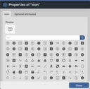
Scrivito lets you provide custom editing functionality for page or widget properties. Most often, the built-in editing tools for changing attribute values such as text, numbers, images, etc., are smart enough to satisfy even dainty editing demands. However, various use cases are conceivable in which special editing functionality not covered by Scrivito’s tools is desired or needed. This is where Scrivito’s UI extensibility jumps in. The Portal App, for instance, includes an advanced icon widget with an elegant and easy to use icon picker that was built as a Scrivito extension.
Customizing Page and Widget Property Editing Using Extensions
Customizing Page and Widget Property Editing Using Extensions


In this tutorial, we are going to develop an Instagram style picker extension for the Portal App’s ImageWidget. This extension lets you assign one of a multitude of Instagram “filters” to the image in an ImageWidget in order to create interesting optical color effects.
With Scrivito, letting a user select one of several options can be achieved using an attribute of the enum type. Scrivito does have a built-in editor for enum values, but with a growing number of options, the properties dialog can get quite cluttered, so writing an extension seems obvious. Additionally, we’d like to display a preview of the styled image.
Downloading the CSS and providing it to the app
First things first, so directly download the Instagram CSS file provided by Yan Zhu at GitHub.
Store the CSS file to your app’s “src/assets/stylesheets” directory, then open the “index.scss” file from the same directory and add the CSS file to the imports:
That was it! The styles are now ready to be used.
Add an attribute to the image widget class
For the selected Instagram “filter” name to be stored in image widget instances, we require an attribute; so open “src/Widgets/ImageWidget/ImageWidgetClass.js” and add an enum attribute to it. We’ll name it instagramStyle and provide it with the CSS class names we took from the repo:
The enum attribute type ensures that only one predefined value from the component we’ll provide further down can be set.
Make the ImageWidget’s properties dialog use a Scrivito extension
The properties dialog of a widget (or page) can be configured using a call to Scrivito.provideEditingConfig in the corresponding “*EditingConfig.js” file. So let’s introduce our not yet existing Instagram style selection component to the properties of image widgets; simply insert a propertiesGroups array with one element at the top level of the configuration like it’s done here underneath properties:
Each element returned by the propertiesGroups callback adds a tab to the properties dialog. Next to the title and key keys, you can either specify a component to use for displaying the tab’s content, or the properties you want Scrivito to make editable on this tab.
We named our component InstagramStyleTab in accordance with the instagramStyle widget attribute we chose above. When using a component for a tab, it is expected to take care of all the editing functionality on the tab, whereas properties are handled by Scrivito. (So, if a widget or page is equipped with a larger number of attributes, you can divide them up between any number of tabs instead of cluttering the “General” tab using properties at the top level.)
Providing the style selection component
With the Portal App, UI extensions can be found in the “src/Components/ScrivitoExtensions” directory, so let’s place our Instagram style picker component there, too:
We’ve put the list of filter names directly into the component, but you might alternatively import the list to keep the code lean. Basically, the render method iterates this list to generate option elements inside of a select. Each option tag is given a selectable value, and the select tag has an onChange attribute for the event handler to use when the selection changes.

The event handler, setInstagramStyle, updates the widget’s instagramStyle attribute. It converts the empty string representing the “None” option to null, which is the enum attribute’s equivalent for “no value selected”. In the select tag, the current value is set using the reverse conversion (null becomes the empty string).
Note that the component doesn’t need to make use of state since the selected value is directly written to the widget which causes Scrivito to instantly update the widget instance on the page.
After generating the select element, the render method displays the image widget, applying the currently selected style to it, so the user can see the effect of their action.
For styling the tab, we are using the CSS classes from the Portal App’s “Social cards” tab.
What’s next?
Instead of using a select element for offering the styles and applying the selected one to a preview, you could render a clickable thumbnail for each “filter” to give the user an impression of the whole set of styles.
The above component uses Scrivito.ImageTag to render the preview of the image in the widget. In editing mode, this makes the image selectable via the Content Browser. If you don’t want this, you can use an ordinary <img> element instead, like so: